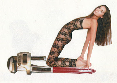
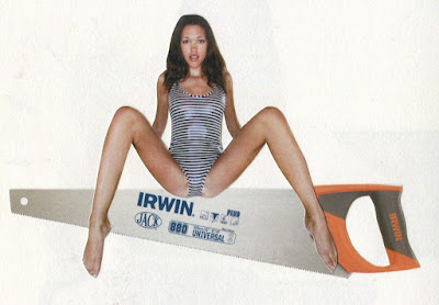
so all in all, a pretty sexist and vile advert towards women, I think I have succeeded!
Wednesday, 20 April 2016
Friday, 15 April 2016
DIGITAL IMAGES
I'd say these were as close to 'final images' that I am going to get. It was difficult as we weren't set a task to necessarily create a final piece as such, but I did really want to produce some images as a result of all my research!
After experimenting with hand-made collage and digitally worked collage, I am definitely happier with the digital outcomes. I feel as though they are more clean and crisp, and the text looks a lot better. I think the 'show her it's a mans world' and 'these tools don't come in pink' are my favourite two outcomes, I think the motif of the woman works and fits well with the text and these are the two i'm probably most happy with.
WHAT I LIKE:
- I like that they work quite well as a set. This was my intention and I used the same font throughout each and the same brand name, which is what I think links them together
- I like the bold text, and how it has fit in quite nicely with some of the images
- They do seem to me quite masculine, which is what I was going for!
- I like the composition and the simplicity of most of them; and I feel like they work a lot better this way. I didn't want to have too much going on incase it diverted attention from the main point
- the repetitive use of motifs in some of them; I used the brush preset tool to create these and I think they work well
- they were really fun to make
WHAT I'M NOT SO KEEN ON:
- I feel so sexist making these!!!!! obviously they do not reflect my actual views whatsoever, but boo!
- I think some could have done with a background image
- I maybe could have thought about adding multiple tools into one image, instead of just the one
- I also could have thought about sticking to just one colour scheme through all the images
- the fact they are done digitally does take away from the hand made feel of collaging a bit
Thursday, 7 April 2016
HAND MADE COLLAGE
PROS AND CONS?
PROS:
- I like the hand made feel as I think it is more personal to myself and the reader.
- It seems a bit more raw and honest
- it was interesting laying out all the different components and seeing how they looked together
- more charming
- I like the cut paper
CONS:
- I think it looks a bit messy and unprofessional
- It is a lot more difficult to mess around with different layouts, colours and compositions this way
- I think text looks better digitally done; and that way it doesn't have to have a white background behind it
- it is quite fiddly! although I guess that isn't really a con as I enjoy doing it, but it is pretty time consuming
Saturday, 2 April 2016
visual journal developments
These are some simple collages I made using american apparel adverts and some typically masculine products. I think these are the images I want to progress further with and maybe try and make into some advertisements of my own.
I think I need to explore type to use on these, and maybe think about using more cut paper shapes and possibly some other media, maybe pencil or pro marker?
Subscribe to:
Comments (Atom)


