Tuesday, 29 November 2016

STUDY TASK 2: ESTABLISHING A RESEARCH QUESTION

OUIL501 - STUDY TASK 2 - ESTABLISHING A RESEARCH QUESTION
Suggested Research Question.
This can be a topic or theme, but please try to be as precise as possible.

I’d like to explore mental health in my essay, as i’m really interested in potentially getting into art therapy as a career. I could also look at mental health in terms of stereotypes, MH in the media etc, forms of therapy, representations, common misconceptions people have of mental illness, how it creates stigma 
“How is mental health portrayed negatively in the media?”

Which Theorists Related to this question?
You can find these on eStudio - Try to list at least three.

McManus, S., Meltzer, H., Brugha, T. S., Bebbington, P. E., & Jenkins, R. (2009). Adult psychiatric morbidity in England, 2007: results of a household survey. The NHS Information Centre for health and social care.

Brian K. Ahmedani, Ph.D., MSW

Which Academic Sources Are Available On The Topic?
What examples of practice / practitioners / images have you discovered?
Include a Harvard Referenced bibliography of at least 5 possible sources.
  • Tartakovsky, M. (2017). Media’s Damaging Depictions of Mental Illness. Psych Central.
  • Suzdaltsev, J. (2014) We Spoke to a Psychologist About Hollywood's Depictions of Mental Illness
  • McManus S, Bebbington P, Jenkins R, Brugha T. (eds.) (2016). Mental health and wellbeing in England: Adult psychiatric morbidity survey 2014
  • Amaechi, J. (2017) Stereotypes, suffering, sympathy - mental health and the media
  • Fawcett, K. (2015) How Mental Illness is Misrepresented in the Media

How Could The Research Question Be Investigated Through Practice?
What types of illustrations would you make in response to this, and why? Think about processes too.


I have seen a lot of illustrators tackling the subject of mental health, for example Ruby Elliot and Gemma Correll, so maybe I could create image similar to these which are based on the things you feel when suffering. I could even link this in with my essay, and not only talk about the damaging stereotypes we see in the media but also what illustrators and illustration is doing to potentially break the stigma 

Monday, 28 November 2016

TUTORIAL 28/11/16


My tutorial today with Pete was super helpful as i've been a bit worried about what to base my essay on; we spoke about potentially looking at mental health as a subject topic which is something i'm really interested in. I think a good thing to focus on would be the stereotypes we see of mental health which portray it in an accurate and negative light. I think I'll look first at TV and film as I know this is where a lot of people get their information on mental health (and a lot of other things) from ! 

Monday, 10 October 2016

STUDY TASK 1: illustration and authorship

In Roland Barthes text “The Death of the Author’ he critically analyses the relationship between the author and the reader of a text, and the readers interpretation of it with a disconnection from the author. Barthes explains that the author and his life, views and background have a huge impact on the way the text is perceived, for example he says ‘Baudelaire’s work is the failure of Baudelaire the man, Van Gogh’s his madness, Tchaikovsky’s his vice’ (143) and that the work would be read in a completely different way if the author was removed from the text. He believes that the reader should be able to make up their own ideas and not be swayed by ‘the author, his person, his life, his tastes, his passion’ (143).
Within illustration, the hand of the maker in my opinion is often shown, and I feel this is important within the practise; illustrators should be able to portray their views, and put across a message in their own voice, at the end of the day it is their own work and removing them from it almost discredits them. The creator should be appreciated for their talent and hard work.


Barthes does argue that society gives too much importance to the author, saying it has ‘discovered the prestige of the individual’ (143) as oppose to the work itself. This means that once an artist is deemed successful, all of their work will be seen as such and it will almost be prematurely liked, almost disregarding what it actually looks like. Jean Jullien could be an example of this, although I love the aesthetics of his work, because of his popularity everything he produces now seems to be universally liked mainly because his name is attached. By detaching the author, it can drastically change how the work is viewed, swapping around the power and now giving it to the reader instead, leaving them to ignore the background and the factual elements.

Wednesday, 4 May 2016

OUIL401 end of module evaluation

1.  What skills have you developed through this module and how effectively do you think you have applied them?

Something I definitely feel as though I have progressed in is my research. I’m usually terrible at finding a wide range of useful research from different platforms, but I feel within this module my research has helped me considerably with planning out my essay and visual responses. Something else I think I have progressed in is essay writing, I remember how nervous I was to even start my essay, but once I got going I realised it wasn’t all that scary, and it’s really helped me with not only my writing skills, but also triangulating and Harvard referencing too; something I was a complete amateur in before. 

2. What approaches to/methods of research have you developed and how have they informed your practical outcomes?

Within my research, I have tried to branch out a bit more from just the usual google search, which is something I have been more than guilty of in the past. I extended my research into looking at case studies, and making a trip to the library to gather some relative books that would help me. A lot of the research I did was looking at adverts themselves, and this has informed my practical outcomes massively, from the images themselves to the type and colours used. The collection of quotes I found was also something that informed my visuals, as I could make images directly based on quotes I had come across.

3. What strengths can you identify in your work and how have/will you capitalise on these?

I think my visual journal and some of my visual outcomes are probably my biggest strengths within this module, and this has been informed by a huge amount of research. I feel like choosing to use collage was a really good idea in the end, although I wasn’t sure at first as I hadn’t really done it, I think it fits perfectly with what I was trying to achieve and has made for some outcomes I am really pleased with. I think for me another strength would be my research, and although I do still think there is room for improvement, this is a skill I will take into second year and hopefully carry on progressing in.

4. What weaknesses can you identify in your work and how will you address these in the future?

I think the main thing I am not so happy with is my essay; I found it really difficult in writing something so long and in depth, as it’s something I haven’t done in such a long time. I also found it really difficult putting what I wanted to say into words, and this is fairly evident when reading it back; I feel as though it’s probably a bit jumpy and jumbled. I want to try and work on my writing skills for the future, as I know its a really important part of this module, and I need to start learning to ask for help when I need it, instead of shying away and hoping help will come to me.

5. Identify five things that you feel will benefit you during next years Context of Practice module?

The main thing I want to achieve next year is staying motivated for context of practise all year round, once I got into it I really enjoyed researching and creating, but there has certainly been times this year where my commitment as dropped, and this is probably evident within my work. 
Again, working on my writing and analysis skills is something else I feel would really benefit me; this is a really important one as clearer writing makes it easier for others, and myself, to see what I am trying to achieve. 
Being more exhaustive with ways of image making would be something else that would help me, although I am happy I chose collaging, I didn't really explore many other options which is something I would like to do next year. 
Managing my time better is a must for next year! Being unorganised has really knocked me back during this module especially; I think I could have produced more work if I had had a better structure of working. 
And finally, I think something else that would be a step forward, would be embracing making mistakes. I am usually worried of making mistakes, but sometimes they can be a good thing and lead you to new places and ideas!

6.How would you grade yourself on the following areas: 
(please indicate using an ‘x’)  

5= excellent, 4 = very good, 3 = good, 2 = average, 1 = poor

1
2
3
4
5
Attendance

/


Punctuality


/

Motivation


/


Commitment

/


Quantity of work produced


/


Quality of work produced


/


Contribution to the group

/


Wednesday, 20 April 2016

analysing my own image


so all in all, a pretty sexist and vile advert towards women, I think I have succeeded!

Friday, 15 April 2016

DIGITAL IMAGES


I'd say these were as close to 'final images' that I am going to get. It was difficult as we weren't set a task to necessarily create a final piece as such, but I did really want to produce some images as a result of all my research! 
After experimenting with hand-made collage and digitally worked collage, I am definitely happier with the digital outcomes. I feel as though they are more clean and crisp, and the text looks a lot better. I think the 'show her it's a mans world' and 'these tools don't come in pink' are my favourite two outcomes, I think the motif of the woman works and fits well with the text and these are the two i'm probably most happy with. 

WHAT I LIKE:
  • I like that they work quite well as a set. This was my intention and I used the same font throughout each and the same brand name, which is what I think links them together
  • I like the bold text, and how it has fit in quite nicely with some of the images 
  • They do seem to me quite masculine, which is what I was going for!
  • I like the composition and the simplicity of most of them; and I feel like they work a lot better this way. I didn't want to have too much going on incase it diverted attention from the main point
  • the repetitive use of motifs in some of them; I used the brush preset tool to create these and I think they work well
  • they were really fun to make
WHAT I'M NOT SO KEEN ON:
  • I feel so sexist making these!!!!! obviously they do not reflect my actual views whatsoever, but boo!
  • I think some could have done with a background image
  • I maybe could have thought about adding multiple tools into one image, instead of just the one
  • I also could have thought about sticking to just one colour scheme through all the images
  • the fact they are done digitally does take away from the hand made feel of collaging a bit

Thursday, 7 April 2016

HAND MADE COLLAGE


PROS AND CONS?

PROS:
  • I like the hand made feel as I think it is more personal to myself and the reader. 
  • It seems a bit more raw and honest 
  • it was interesting laying out all the different components and seeing how they looked together
  • more charming
  • I like the cut paper
CONS:
  • I think it looks a bit messy and unprofessional
  • It is a lot more difficult to mess around with different layouts, colours and compositions this way
  • I think text looks better digitally done; and that way it doesn't have to have a white background behind it
  • it is quite fiddly! although I guess that isn't really a con as I enjoy doing it, but it is pretty time consuming

Saturday, 2 April 2016

visual journal developments


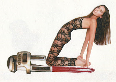
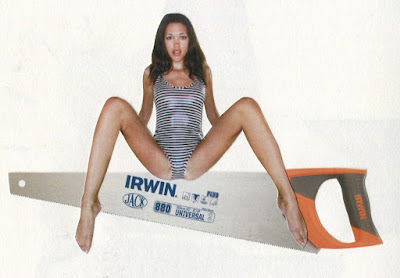
These are some simple collages I made using american apparel adverts and some typically masculine products. I think these are the images I want to progress further with and maybe try and make into some advertisements of my own. 
I think I need to explore type to use on these, and maybe think about using more cut paper shapes and possibly some other media, maybe pencil or pro marker? 

Saturday, 19 March 2016

more visual journal: COLLAGING

I decided to start exploring the idea of making up some of my own examples of advertisements aimed a the male audience, using heavy gender stereotypes (obviously these aren't in the least bit serious)

These revisit the ideas from earlier in my visual journal about women being like objects, but instead I have used images of woman to help appeal these already masculine objects to men.


  • I have used some pictures of women usually seen in old paintings; I thought this would give quite a comical effect, and also show the idea of modern day sexualisation, as in those days women were not really sexualised in the same way
  • I added a little bit of detail using a coloured pencil, just to contrast with the collage


I also tried to add in some text for extra effect. I feel as though the word 'power' is predominantly used in masculine advertising, as it makes men feel good about themselves and emasculates them
  • I like the idea of the women lying on the tape measure as it is also illustrating the point of women being conscious of their size and how they look, and whether or not they appeal to men
  • a lot of these were all just random images I printed out, but I think I need to focus a bit more on the way they go together. I think if looks better when the images fit well together 


these two are images taken from american apparel adverts. I really like how these two work as images! I feel as though they are a bit more refined
  • I think the idea of using the AA ads works well and definitely fits into my theme
  • this also shows more modern day sexualisation of women  
WHERE TO GO NEXT?
  • Like I said, I think I need to think more about how the images fit together with each other
  • I want to explore using the american apparel ads with the tools 
  • try and incorporate more typically masculine colours, to add to the massage I am trying to get across
  • start thinking of some more slogans and tag lines 

Saturday, 12 March 2016

does sex sell?


so in my previous blog post, I wanted to explore the idea of whether or not sex really does sell within advertising, even when it has nothing to do with the product in hand? Even as far back as the late 1800s naked women were used to sell tobacco. does sexualisation of the male and female bodies work? does it make people buy the products? or does it actually put people off?

well, the american psychological association (ASA) conducted a study made up of 53 experiments that included 8,489 participants which examined this question. At the end of the study, it actually showed that sex 'never helps brand memory'.

"when brands use violent or sexual content, our attention goes more towards the sexual and violent content at the expense of our focus being on the actual brand or product itself" Alessandra Litchenfeld

I suppose this means that advertising will gradually start becoming less sexualised; and in 2015 brands such as american apparel and Abercrombie and fitch released statements saying that they will be de-sexualising their adverts to attempt to increase sales!

Thursday, 10 March 2016

the strange world of advertising

"advertisements guide thinking, action and behaviour as people come to accept mainstream ideas through visuals. The most crucial of these is what it means to be a man or a woman. Ideas about how to feel, dress, look and behave, and how to interact with other men and women is the bedrock of culture in which we live."

so to help me a little with my visual journal and my visual outcomes, I wanted to dive a bit deeper into the world of advertisements, and ones specially aimed towards a male audience.


I feel like the main theme within these three ads is mocking women to empower males and making them feel like the more dominant sex. I noticed there was a huge amount of adverts aimed at males belittling women, and it seems to be quite a recurrent theme within advertising. I definitely think this sort of thing is where a lot of the gender stereotypes have stemmed from, and continue to do. I think this sort of message has become a sort of joke now, but jokes aside, why should a whole group of humans be degraded just to please another?


this one is pretty self explanatory. shut up, yorkie 


The main themes of these ads are undoubtably dominance and power. This is apart mainly from the stances and how the men are posing with the females. The way each of the women are shown lower down, with the men above them looking down on them is a clear indication that the man is in control, and that the women is the inferior. 
"The varied dimensions of posture, position of bodies, location of body parts, height and depth of figures, all suggest that women are inferior, and men are superior" Scott A. Lukas


Something else that seemed to keep cropping up, was the idea of women being used as sex objects within advertising. Through a bit of research, its evident that sexualising woman to draw the audiences attention to the object being advertising is considered an effective sales tactic. I think something I need to research on is whether this actually works, does sex sell?


so these are a couple of adverts more directly related to my theme, I sort of knew there were going to existing adverts using women to advertise mens power tools, and I guess I was right. I didn't even realise it was possible to sexualise a power tool, and especially in a serious way as mine were intended to be more of a mock take, but it looks as though it is.